How to Create an Infographic for Less Than $500
This YouMoz entry was submitted by one of our community members. The author’s views are entirely their own (excluding an unlikely case of hypnosis) and may not reflect the views of Moz.
In my last YouMoz post, I said you just shouldn’t bother with a $500 infographic, and it caused quite a stir. I stand by this statement: if you are looking to pay someone $500 to produce a successful infographic which includes everything - research, design and promotion - you are simply not going to get the results you want.
But that doesn’t mean, if you only have $500 budget, you shouldn’t bother. There are ways to succeed, if you are willing to put the work in yourself.
Here are six tips on how a little hard work can help you and your team create an effective infographic for less money.
1. Keep the concept simple, but unique.
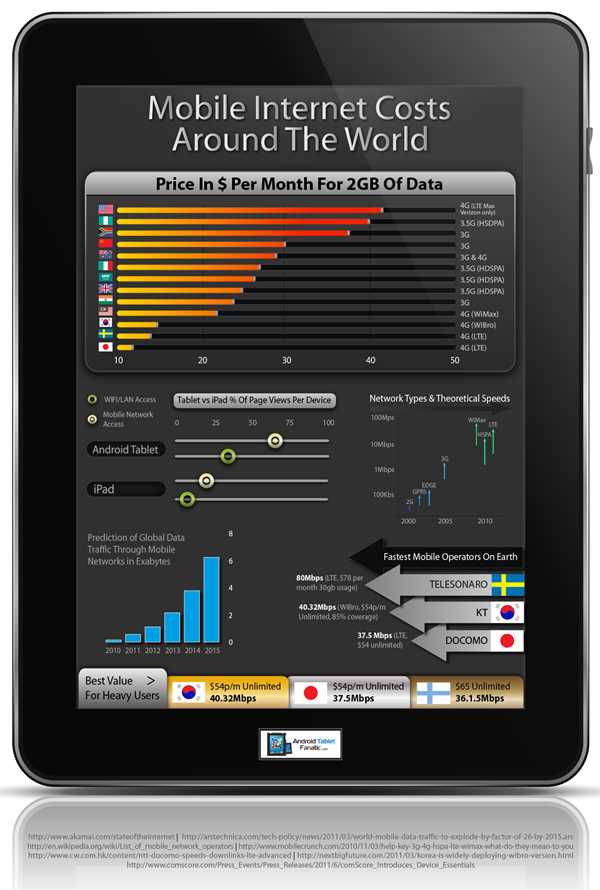
My first ever infographic was a huge learning curve. Through sheer determination and $100 budget for design, we pulled something pretty successful out of the bag. And the key to success was RESEARCH. We took a week researching, spending hours and hours (expanding into the ‘unsociable’ realm) to come up with a suitable concept and content. We developed the concept ‘Mobile Internet Costs Around the World.' In its final form, the graphic illustrated the consumer price per megabite for using a tablet device around the world.
It wasn’t the most amazing piece of art you’d have ever come across, but it fulfilled its purpose: to visualise the data. The infographic picked up some really tasty links, and this is why: We did serious research on a topic that people were interested in and, more importantly, no one had done it before.
Now imagine if we had tried to pull an infographic together about a general topic such as ‘How Awesome Tablets Are.' To make a decent graphic with so much scope, you would need a pretty big budget; the design costs alone could be way over $500. When you're on a small budget, try to just pick one interesting aspect of your industry and spend a lot of time researching. Think about how you can visualise it in an informative and interesting way.
Remember, bloggers don’t need a graphic to tell the whole story; they just want a hook so they can write a blog post or tweet.
2. Research is king; invest in quality data.

Hookable research isn’t easy to obtain. For the ‘mobile internet costs’ infographic, there was no single report that had the data we needed, due to the nature of the industry. We had to search far and wide, and when we hit a brick wall, we needed to get creative.
We spent several days finding out the price of 1mb of data from mobile providers from across the world. The English speaking world was relatively easy. We had to think outside the box for Korea and Japan; a little help from some Facebook friends did the trick. To make sure our data was as accurate as possible, we even rang up different companies to make sure we were getting the latest price offered to consumers.
Due to the uniqueness of the data set, it was highly valued by bloggers. It also had a great hook – 1mb of data cost more in the USA than in Zimbabwe. We didn’t know this to be the case when we started, but we let the statistics tell us the story.
More great insights into how data visualisations can do amazing things if you let the statistics tell the story.
3. Design: The clearer the brief, the better the results
Design is one of the greatest cost associated with developing an infographic. This cost is one of the main reasons that puts people off creating their own. If you don’t have a designer in-house, you’ll need to outsource the work to an affordable alternative, but you’ll need to do some prep work prior to contacting them.
- Provide a coherent brief. This should explain the infographic concept, objectives, target audience, and style so that the designer is clear on what you need. Include the written copy which the designer will be working with (making sure that has been proofed and edited).
- Provide examples of infographics. Choose designs that would work well with the data set and a design which appeals to you and your brand. This way the designer better understands what you’re looking for.
- Target designers who are already creating work in the style you need. It’s easier to get an infographic that’s whimsical, edgy, or feminine if the designer you hire already has experience creating this kind of work.
The more you spell it out for the designer, the less guesswork they will have to do and the more straightforward the process will be. Asking a designer to create an infographic from a headline alone may seem like less work, but in the long run you’ll feel the strain.
4. Finding your designer

Now that you have your concise brief, it’s time to look for your designer.
- Freelance sites: Sites such as ELance and Odesk can be great – but be sure to check out previous work and make sure you’re offering at least $300 to make sure you get quality applicants.
- Graphic design students: Your local university and college will have plenty of young designers looking to get experience. Look for students who love infographics. Bear in my mind that students will require a lot more supervision than freelancers. If you’re looking to publish graphics over the long-term rather than just a one-off, graphic design students can be a great investment.
- Small design studios: Potentially you could pay small graphic design studios/local freelancers to provide design only. You would be looking to pay more around $500, but you will benefit from the face-face time to explain the brief.
I can’t stress enough: if your brief is complex and lacking in detail then no matter who you choose to design, you will have a lot of work on your hands!
5. Plan promotion from the beginning.

When done right, the promotion stage can push your infographic all over the web and get lots of links to boot. There are plenty of guides to help you on your way:
How to Promote an Infographic
Getting the Maximum Number of Links from Your Infographic
Infographic Marketing
Advice on Promotion
- Finding out who your potential linkers are: If you tailor your infographic to your audience before you publish it, you much more likely to gain greater coverage once complete.
- Offer exclusives: Here at Neo Mam, we contact publishers prior to posting. We can then offer an exclusive or even make changes based on their feedback. I would recommend saving this tactic for the big sites where an infographic placement would get you in front of a lot of eyeballs.
- Infographic directories: Using infographic directory sites can be useful as some small bloggers use them for finding graphics. However, it may be worth passing this job onto an intern or outsourced team member to save your time to build up relationships with bigger sites that are far more valuable.
6. Repurposing

You have spent a few days researching a topic so why only create an infographic? Repurposing your research is a great way of squeezing a few extra $$ of return from your investment.
Potential ideas include:
- Creating a interactive widget
- Creating an article or guest post that includes the graphic
- Cutting up the graphic and utilizing it within guest posts
- Creating a video version of the infographic
A more in-depth look at repurposing your infographic
Have you had a good experience with DIY infographics? Any tips you can share?


Comments
Please keep your comments TAGFEE by following the community etiquette
Comments are closed. Got a burning question? Head to our Q&A section to start a new conversation.