5 Awesome Infographics for "Boring" Niches
This YouMoz entry was submitted by one of our community members. The author’s views are entirely their own (excluding an unlikely case of hypnosis) and may not reflect the views of Moz.
In my last post for SEOmoz, someone asked me if infographics can still be successful for a “boring” niche.
Niche topics can be pretty dull and inaccessible to most people. However, I believe that any niche can be made interesting by using ‘topic bridging’. By creating content with key hooks that people actually care about, and providing attention grabbing material for various audiences, you can make boring topics much more interesting.
(Thanks to Dan Thies for defining the concept of topic bridging - http://www.seofaststart.com/)
The following examples illustrate easiest the concept of topic bridging, so sit tight and enjoy some awesome infographics created for really “boring” niches. (Don’t worry none of them are mine ;)
1. 3 Questions about US Debt

U.S. debt is a long and complex issue. So how do you produce something the average consumer can understand?
This infographic from Fisher Investments finds the perfect solution.
The infographic quickly identifies 3 hooks that most people care about, and uses visualisations to explain these concepts clearly. This infographic is functional in its design and personally it’s one of my favourites.
Understandably, Forbes pounced on this infographic and got it some decent exposure. However, Fisher Investments chose to load the graphic onto a flickr account instead on their own domain which likely restricted outreach. With the right kind of outreach this graphic could have spread widely across the web.
Tl;dr: For large heavy topics try to only visualise the areas that people care about.
2. MBAOnline.com

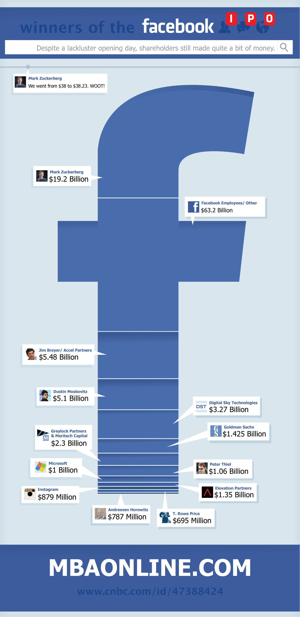
An infographic on reasons to study an MBA would reach very few interested people. However, MBAOnline smartly tapped into one of the biggest online IPOs- Facebook.
A successful infographic has an active audience interested in linking and sharing your graphic. Naturally, tech crowds are extremely active within social media, so if you can bridge your idea to fulfill your own niche with a combined technology angle then go for it!
This infographic used a great hook to get a wide audience range interested– exploring who got rich from the IPO. The design illustrated this using a wonderfully simple approach. The infographic also gained attention by going against the grain; the sentiment at the time was that IPO was a failure. This infographic celebrates its success.
Tl;dr: Bridge your niche with tech to increase your potential audience and challenge common belief to stand out.
3. Why Reuse A Cup

Sometimes, you need to get creative when it comes to your niche. Take paper cups for instance. There’s nothing new about paper cups; we use them every day and they’re pretty boring to most of us. By taking an eco hook, Factorydirectpromos.com created an infographic which teaches the audience about the true value of the paper cup. Suddenly the paper cup, that boring, disregarded item, becomes of interest to every single one of us.
Factorydirectpromos.com creates reusable products such as bags, bottle and cups so the infographic fits in perfectly with their niche. This infographic is not perfect by any means, but it creates the hooks needed for bloggers and social media users to pick it up and write a story about the content.
This simply designed infographic picked up links from lots of respected eco blogs including the mnn.com, care2.com and onegreenplanet.org.
I’m sure this graphic provided a great return on investment for the team at factorydirectpromos.com.
Tl;dr: Tapping into a product that everyone uses is a great way of building interest and aiming it at specific niche (eco) guarantees success with promotion.
4. Lawyer

Instead of your typically drab ‘personal injury’ coverage that most people are sick of hearing about, The Law Office of Daniel Rosen has taken a different approach when thinking about an infographic.
The infographic hooks perfectly into his service (auto accident injury) and at the same time offers a great hook for technology lovers, looking at the possibilities of driverless driving.
This idea works because it’s something that most people are vaguely aware of but don’t understand in detail.
The design is awesome and the visuals work because it helps to explain a detailed concept easily.
Some great link wins including a great one from fastcompany.com.
Tl;dr: Find the gaps in knowledge that your audience has and fill it – and a tech angle always helps!
5. Girls are better than boys

This graphic is for the site EngineeringDegree.net and their idea is based around the fact that in a room of 25 engineers only 3 will be women.
Rather than go down the boring route of just outlining the facts they just to go for the contentious hook “Girls are Smarter than boys – but where are the women in math and science?”
This graphic is another great example of simplicity done well. They only take 3 points but provide visualisations that really emphasise their point. The stats help to tell a story to really provide a sticky idea that people can share easily on their blog or through social media.
Conclusion:
By decoding the framework of a good infographic, I can really see why it works. I will then implement this approach when producing infographics for our clients. However, don’t rip good ideas off as this will eventually fail.
Have you got any great examples of awesome ideas to share? I’d be really keen to hear about how you get creative in really ‘boring’ markets.


Comments
Please keep your comments TAGFEE by following the community etiquette
Comments are closed. Got a burning question? Head to our Q&A section to start a new conversation.